

Creating Engaging Loading Animations with Mantine Spinner
A Deep Dive into the Mantine Spinner Component


In modern web applications, providing visual feedback during loading processes is crucial for user experience. The Mantine Spinner component offers a simple yet powerful way to create engaging spinner effects with customizable options. This article will explore how to effectively use the Mantine Spinner, enhancing your application’s interface with minimal effort.
What is Mantine Spinner?
The Mantine Spinner is a component from the Mantine UI library, which can be found here. It allows developers to create spinner effects that can be easily integrated into any application. With its straightforward API, you can customize various properties to fit your design needs.
Installation
To get started with the Mantine Spinner, you need to install it in your project. Use the following command:
yarn add @gfazioli/mantine-spinnerAfter installation, import the styles at the root of your application:
import '@gfazioli/mantine-spinner/styles.css';Usage

The Spinner component is simple to implement. Here’s a basic example:
import { Spinner } from '@gfazioli/mantine-spinner';

function Demo() {
  return <Spinner />;
}
This code snippet creates a default spinner. The Mantine Spinner allows for various customizations, including size, inner size, segments, thickness, speed, stroke linecap, direction, and color.
Customization Options
You can customize the Spinner with several props:
Size: Controls the overall size of the spinner.
Inner: Adjusts the inner size.
Segments: Defines the number of segments in the spinner.
Thickness: Sets the thickness of the spinner lines.
Speed: Changes the rotation speed.
Stroke linecap: Determines the shape of the ends of the lines.
Direction: Sets the rotation direction (clockwise or counterclockwise).
Color: Allows you to specify the spinner color.
Here’s an example with custom properties:
<Spinner
  size={194}
  inner={58}
  segments={20}
  thickness={6}
  speed={1500}
  color="#D04FB1"
/>
Styling the Spinner
The Mantine Spinner is also highly customizable through CSS. You can add your styles to enhance the spinner's appearance. For example:
import { Spinner } from '@gfazioli/mantine-spinner';
import classes from './Spinner.module.css';

function Demo() {
  return (
    <Group align="center" justify="center" gap="lg">
      <Spinner className={classes.pulse} />
    </Group>
  );
}
@keyframes pulse {
0% {
transform: scale(1);
}
50% {
transform: scale(1.2);
}
100% {
transform: scale(1);
}
}
@keyframes rotate {
0% {
transform: rotateZ(0);
}
100% {
transform: rotateZ(-360deg);
}
}
.pulse {
animation-name: pulse;
animation-timing-function: linear;
animation-iteration-count: infinite;
animation-fill-mode: backwards;
animation-duration: 1s;
}
.rotate {
animation-name: rotate;
animation-timing-function: linear;
animation-iteration-count: infinite;
animation-fill-mode: backwards;
animation-duration: 18s;
}In this example, we apply a custom class to the spinner for additional styling.
Random Spinner Effect
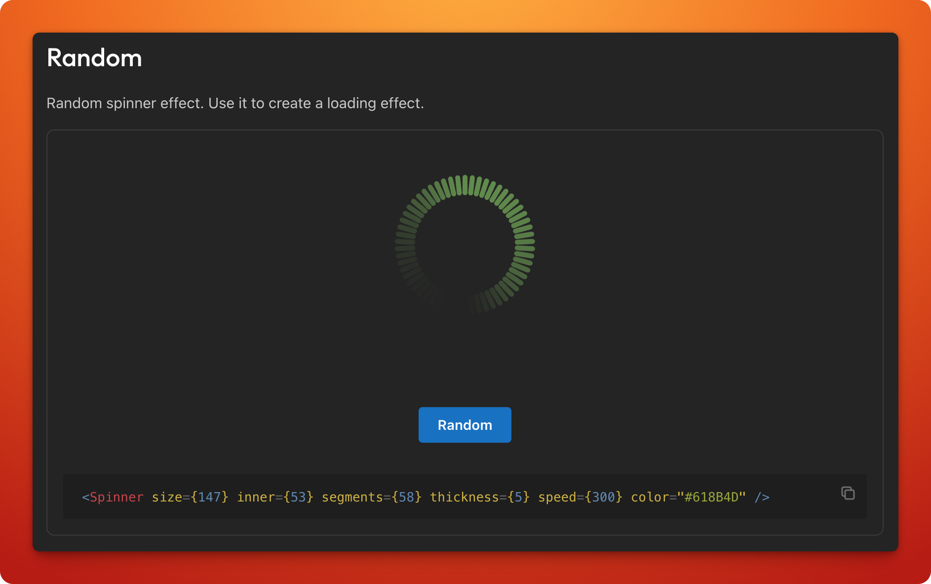
You can create a random spinner effect for more dynamic loading animations. This can be particularly useful for applications requiring varied visual feedback. Here’s how to implement it:
<Spinner size={194} inner={58} segments={20} thickness={6} speed={1500} color="#D04FB1" />Conclusion
The Mantine Spinner component is an excellent tool for enhancing user experience in your web applications. Its simplicity, combined with extensive customization options, allows developers to create visually appealing loading animations effortlessly. For more extensions and components, check out the Mantine Extensions site.